Psychology insights for Spare Parts Webshops and Service Portals
Top 5 conversion killers or boosters
Larger companies have teams of psychologists who use knowledge about our brain and behaviour to influence choices on a website, keep customers on ‘the automatic pilot’ in the order process and maximize conversion in a webshop.
As we operate in the market of spare parts webshops, we started ‘gathering’ the most useful insights. We have listed the most important ones below. They are true conversion killers or boosters, depending on how you use them.
Top 5 conversion killers or boosters
1 – Stress: you’re not thinking clearly >
2 – Uncertainty: the need for closure >
3 – Simplicity: why your brain loves it >
1
Stress: you’re not thinking clearly
For our own company, we did some research and interviewed a number of clients. After the interviews, we realized one important thing: customers like service engineers and mechanics order their parts mostly during some sort of ‘stressful’ situation. Something is broken, time is money, service contracts are under pressure.
Stress prepares your BODY for a fight or flight reaction, not your BRAIN. This makes it more difficult to think clearly and make the right choices in finding your way in a webshop. Stressed customers will be looking for 2. certainty and 3. simplicity.

2
Uncertainty: the need for closure
Your customers have a clear goal in mind: finding and ordering the right part ASAP (remember stress). When too much information, unconventional navigation, lack of visuals, etc… are preventing a speedy ordering, customers are no longer sure they will reach their goal.
Psychology tells us that our brain can’t cope with this uncertainty. We have a need for closure: the problem MUST be solved, as quickly as possible. If the uncertainty can’t be resolved instantly, there’s no solid basis for any next decision. Stress and irritation rise to a point where customers leave your webshop. They’ll choose any other webshop that gives them ‘closure’, even if the price is substantially higher.

3
Simplicity: why your brain loves it
Psychologist and Nobel prize winner Daniel Kahneman once said: ‘Thinking to man is like swimming to cats. We can do it, but we’d much prefer not to.’
Thinking hard costs energy, is tiring and slow. But make information easy to process and our brain loves it: we perceive simplicity as ‘familiar’, ‘true’, ‘good’ and ‘effortless’. It’s not by chance that almost every successful site or app has taken a complex product, service or proces and somehow simplified it using new technology.
Simplicity beats stress, uncertainty and even higher prices, so whatever you can do on your webshop, in your ordering process or even your products … do it!

4
Visuals: if you can imagine it
How can your customers be sure the part they’re ordering is the one they need? Spare parts are not known for their distinctive names, so visuals are the key.
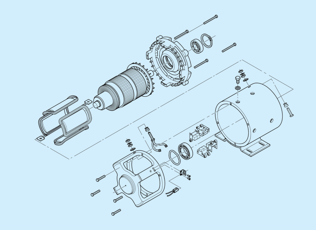
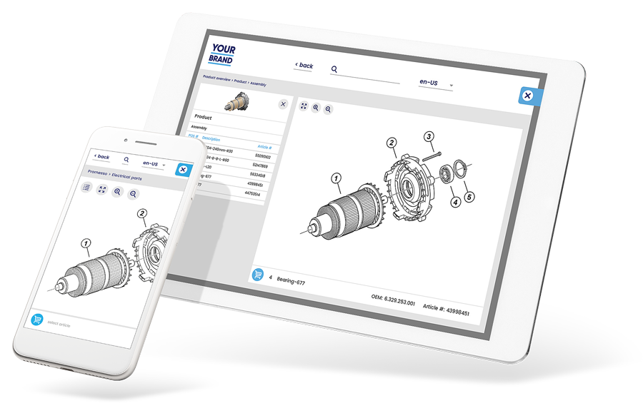
We are biased. We founded our innovations on the use of exploded views: they’re both cost effective (freely available from parts catalogs) and a perfect way to navigate spare parts. As it shows all parts in relation to adjacent parts, it ends confusion about which part to order, making life easier for service engineers.
There is also an important phenomenon at work here: the visual depiction effect. If our brain can imagine how to use a product or how to put something together, we are more likely to buy…
5
User Experience: please, stay inside the box
When it comes to the design and navigation of your webshop, there is one important rule: stick to conventions. Don’t experiment, but copy. Your logo should be in the left upper corner, search field and login in the right upper corner. Search results should preferrably look a bit like Google’s, buttons and links are recognizable as such in every aspect.
Where to put your most important buttons? In the middle. When given three equal choices, 70% of people want to click the middle one. Our brain just values information right in front of us as more important and more valuable.

Hans Janssen
Selling spare parts?
Maximize conversion!
We are sparesparts.live. We bring visual navigation to spare parts Webshops, to minimize order mistakes and maximize conversion.
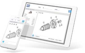
By simply using your parts catalogs, converting them into clickable exploded views and connecting them to the products in your Webshop. This makes it much easier to find and order any part.
Like to know more?
Our solution?
Add visual navigation!
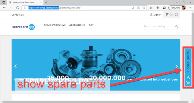
A fully responsive visual navigation add-on for your Webshop.
Take a quick tour:
(spareparts.live in 2 minutes)
Start FREE today!
See the effectiveness!
Do you have access to parts catalogs with exploded views and bills of materials? Sign up and start FREE. See the effectiveness at work. We have created some sample files but feel free to use your own material:
- Create an account
- Upload your sample file
- Check results
- Satisfied?
Simply add it to your site
